NetSuite’s dashboard has three advantages over other ERPs that make NetSuite’s dashboard superior.
Freedom of user customization
NetSuite’s dashboards are unique in that they can be freely customized by the user. They can display the most frequently used tasks and information, change the layout,1 for example, list KPIs such as sales, inventory, and customer satisfaction, add portlets based on their role and duties, and change colors and fonts. You can also easily create and edit reports using the standard report builder.
Real-time business visualization and analysis
NetSuite’s dashboards provide real-time business visualization and analysis. As a cloud ERP, its fully integrated BI capabilities allow you to view data and trends on a global level.3 For example, you can see performance and budget comparisons for finance, sales, manufacturing, and other departments, and compare sales and profit margins by region and currency. You can also make forecasts and plans based on real-time data, and look for problems and improvements.
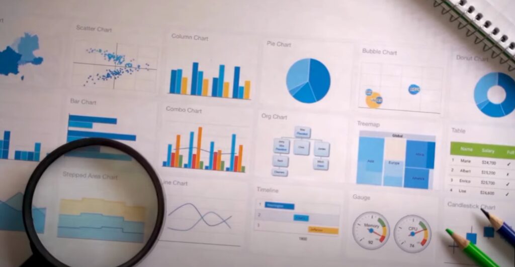
Supports a variety of standard graph views
NetSuite’s dashboards support a variety of standard graph views. Bar, pie, and line graphs can be used to visually represent reports.2 For example, bar graphs can be used to view sales rankings and inventory balances, pie charts can be used to view percentages of customer segments and product categories, and line graphs can be used to view sales trends and changes in profit margins. You can also customize the type, color, and size of the graphs!
Coznet offers proposals for efficient use of accumulated data.